 THE LANDSCAPE PAINTER’S WORKBOOK:
Order now
U.S.: Amazon | B&N | Book-a-Million | IndieBound | Bookshop.org
United Kingdom: Amazon | Waterstones | Book Depository | Books etc. | Bookshop.org
Canada: Amazon | Indigo
Australia: Booktopia
A well-appointed landscape painting palette, like the expanded primaries palette, will allow you to mix just about any color you need. An essential color on that palette is Phthalo blue (pronounced: thay-low), that rich and delicious shade of blue that is able to produce the brilliant “sky blue” color we are all so familiar with.

Ultramarine blue (left) is very different from Phthalo Blue (right). If we mapped each color on the color wheel, we’d see that Ultramarine leans toward the violet side of the wheel, while Phthalo shifts toward the green side. Although Ultramarine is the most commonly used blue on the landscape painter’s palette, it cannot produce the distinct shade of blue that Phthalo can, even when mixed with other colors.
On the split primaries palette, Phthalo is regarded as the warm blue and Ultramarine the cool blue. There is some disagreement about this. Some painters see Ultramarine as the warm blue. For an full explanation of this, see the section on blues in the post The Split Primaries Landscape Painting Palette.
The problem with Phthalo is that it is so intense and strong that even the smallest amount can overpower any mixture. If you were to replace Ultramarine with Phthalo for most of your blue mixes, your painting would take on a strange, acidic blue-green pall.
Less Intense Alternatives to Traditional Phthalo Blue
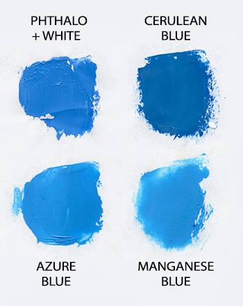
Azure blue from Sennelier is nearly identical to Phthalo when it’s been lightened with white. This pigment is still potent, but much less so than regular Phthalo, so it has less chance of overpowering your mixtures.
Straight from the tube, Manganese blue is about the same mid-value as Azure blue. However, it is much less potent that regular Phthalo.
Cerulean blue, is another pigment that fits into the same “sky blue” blue family as Phthalo. Like Manganese, It’s much less intense, so it will not overpower your mixtures.
If you only have Phthalo, you can reduce its intensity by mixing it with some white. In fact, before I discovered these alternate blues, I always added white to Phthalo on my palette. This not only made the color less overpowering, it also distinguished it from Ultramarine on the palette, because out of the tube, Phthalo and Ultramarine look very similar.
This post yielded many helpful comments from readers.
- There are two other Phthalo-like pigments from Holbein, Hydrangea Blue and Caribbean Blue.
- About the Phthalo blue from Gamblin’s “1980” line of student-grade paint), Carol notes, “Because it has less pigment and more filler, the color is not as intense as regular phthalo.”
- See Tom Hoffmann‘s comments below on how he manages phthalo by mixing it with other colors.
See full comments below.
10 Comments
Mitchell, I always used cerulean blue for my skies before I took your class and tried phthalo. I’d avoided phthalo because of it’s acidic nature. You are right, mixing with white tames it down. I wonder what you think of cerulean? The real thing is expensive and some are a bit too green but I like Gamblin cerulean. I’m trying to get the clear blue summer sky and not quite satisfied yet.
Thanks for the reply, David. Cerulean is a good option, as well, for getting that distinct warm shade of blue. It’s in the same family (another cousin).
Good ideas. I have a handful of paint chip samples and they’re useful to use against the sky. Helps with mixing. The names are fun too.
I have always thought of ultramarine as warm. Why do you consider it cool?
Thanks, Kate, for this question. When I discuss the “cool” attributes of Ultramarine or the “warm” attributes of phthalo, I am expressing a temperature difference. Temperature is a relative measure. A color can never be cool all by itself; it can only be “less cool” or “more cool” than another color … or “warmer” or “less warm” than another color. So when I say that Ultramarine is “cool,” I should be more specific: Ultramarine is cooler than Phthalo, or that Phthalo is warmer than Ultramarine. From this perspective, most people see Ultramarine as cooler than Phthalo and Phthalo as warmer than Ultramarine. But that doesn’t mean you are wrong! Ultimately, what matters is that you see the temperature difference (which you do) and that you can choose the appropriate blue depending on the needs of your mixture. If I had to parse it further, I’d say that Phthalo has a yellow component to it, and so it is “warmer.” Also see Mapping Pigment to the Spectrum at the bottom of this post: Mitchell Albala’s “Expanded Primaries” Landscape Painting Palette.
I keep both blues om my outdoor palette, as I need the intense turquoise that phthalo can make for Hawaiian waters. I find phthalo is usually too strong for skies so use the ultramarine. It is very powerful like you say, so I use it mixed with red and violet to make darks versus using other dark colors. My outdoor palette is down to 6 to 7 colors plus white, but problem is what to do with all the other colors I’ve bought which I now don’t use. Need to do a few abstracts with these variations to make use of them.
Mitch,
I find this discussion fascinating and relevant in several respects. First I have thought of Ult Blue as having a red cast and therefore warmer than cerulean. But that concept did not work for me as exemplified by my always using cerulean closer to the warm horizon than Ult Blue. So I am glad to get that turned around explicitly in my head. Second, I have Ult Blue, Pthalo Blue, Cobalt Blue and Cerulean Blue on my pallet because I regard them as distinctively different, for example Cobalt is weak and transparent but goes well mixed with orange. And I gradate my skies with different blues depending on the amount of sky. But the closest blues for me are my Holbein Hydrangae blue and Cerulean blue. Which only means I have experienced the truth you are promulgating and love working with it. Cerulean is less transparent than Pthalo Blue and weaker. So it is easy when tinting it down to get it opaque and that makes it in my mind or can make it a less attractive sky when painted on a white canvas. So I like to work with pthalo blue with its tinting strength and less white to create a deeper feeling sky and it helps when I want to get a greener sky as we get in the PNW at times. Lastly, Holbein has just changed its name for my lovely Hydrangae Blue which I thought was solely blue, to Pthalo Blue Red Shade which now emphasizes in the name that it was warmer than I thought! With PBRS at one third the cost of Cerulean, I would consider dropping Cerulean if I had to drop a blue, but I like the greens I can make with Cerulean and at times it is better than Pthalo for sky. How about a discussion of yellows?
Hi Mitch! I have been using Gamblin’s 1980 Phthalo blue lately instead of regular phthalo (which I used for years). Because it has less pigment and more filler, the color is actually still just as rich, but not as intense as regular phthalo. 1980 Phthalo seems to have about the same tinting strength as ultramarine, so I use it in all sorts of situations, rather than only cautiously (for sky or turquoise things) as I did before. It sounds like you are happy with your alternatives, but just wanted to say what works for me. : )
This sounds like a great alternative, Carol. Thanks for bringing it to our attention. Let’s add it to the list of alternative to phthalo.
In the Pacific Northwest there are about three days at the beginning of fall when the sky directly overhead is pure ultramarine. The rest of the year I mix cobalt and pthalo for the sky, or cerulean, if I have splurged and bought the real thing.
It took me something like 40 years to embrace pthalo, and I still haven’t sorted out the red shade/green shade business. For landscape work, whichever shade you use needs to be neutralized with plenty of some kind of orange (transparent pyrol or burnt sienna), so much that the little bit of red or green hardly matters.